Note
Go to the end to download the full example code.
Variability metrics
This is an example on filtering the sources in a TraP export database to find the most variable sources. This exmple starts with a TraP export database based on approximately 60 LOFAR 1.0 images at a 2 minute interval. The first three of these images are available next to the export database file in the repository under tests/data/lofar1.
Let’s start by opening the test database.
from trap.io import open_db

db_path = "../tests/data/lofar1/GRB201006A_60_images.db"
db_handle = open_db("sqlite", db_path)
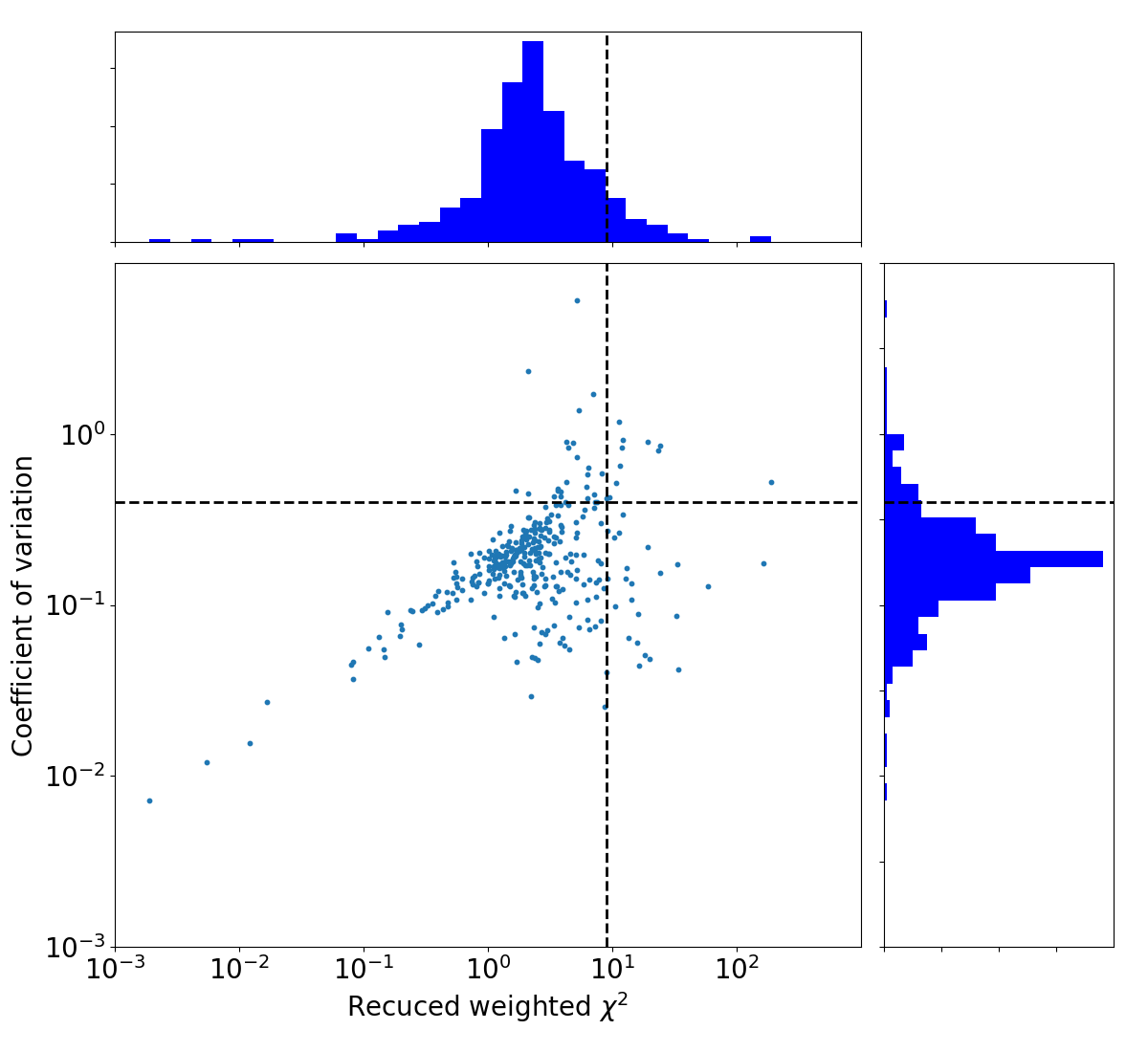
There are two parameters we will use for describing the variability of a source:
The reduced weighted \(\chi ^2 (\eta)\): This is a fit to the light curve. The larger the value the less well it fits to a horizontal line and thus the more variable the source is.
The coefficient of variation (\(V\)): This is the magnitude of the fuxe density variation in the lightcurve. The larger this value, the larger the variation in the flux densidty measurements and thus the more variable the source is.
The sources we are after in this example are those that score high on both of these metrics.
We can calculate these variability metrics by first constructing the lightcurves and then determining the variability within these
lightcurves. This is already done during runtime, where the variability metrics are stored in a table called ‘variability’.
This uses all extracted sources, excluding the force fits. In case you want to recalculate these metrics or use only a subset of sources,
you can use the post-processing function trap.post_processing.construct_varmetric().
import pandas as pd

varmetric_table = pd.read_sql_table("variability", db_handle)
Let’s see what this gives us
print(varmetric_table.head())
   id  newsource  src_id  ...  nr_datapoints  first_image    first_detection_time
0   0          0       0  ...             55            0 2020-10-06 01:22:37.500
1   1          1       1  ...             54            0 2020-10-06 01:22:37.500
2   2          2       2  ...             55            0 2020-10-06 01:22:37.500
3   3          3       3  ...             55            0 2020-10-06 01:22:37.500
4   4          4       4  ...             50            0 2020-10-06 01:22:37.500

[5 rows x 15 columns]
From this table we will select only those sources (rows) where v_int i larger than zero. Now that we have the variability metrics, we can create a plot showing the distribution of the variablility values.
varmetric_table = varmetric_table[varmetric_table.v_int > 0]

import matplotlib.gridspec as gridspec
import matplotlib.pyplot as plt
import numpy as np
from matplotlib.font_manager import FontProperties
from matplotlib.ticker import NullFormatter


def plot_variability():
    left = bottom = 0.1
    width = height = 0.65
    bottom_h = left_h = left + width + 0.02
    rect_scatter = [left, bottom, width, height]
    rect_histx = [left, bottom_h, width, 0.2]
    rect_histy = [left_h, bottom, 0.2, height]
    fig = plt.figure(1, figsize=(12, 11))
    ax_scatter = fig.add_subplot(223, position=rect_scatter)
    plt.xlabel(r"Recuced weighted $\chi^2$", fontsize=20)
    plt.ylabel("Coefficient of variation", fontsize=20)
    ax_histx = fig.add_subplot(221, position=rect_histx)
    ax_histy = fig.add_subplot(224, position=rect_histy)
    ax_histx.xaxis.set_major_formatter(NullFormatter())
    ax_histy.yaxis.set_major_formatter(NullFormatter())
    ax_histx.axes.yaxis.set_ticklabels([])
    ax_histy.axes.xaxis.set_ticklabels([])
    xdata_var = np.log10(varmetric_table["eta_int"])
    ydata_var = np.log10(varmetric_table["v_int"])
    ax_scatter.scatter(xdata_var, ydata_var, s=10)
    ax_histx.hist(xdata_var, bins=30, histtype="stepfilled", color="b")
    ax_histy.hist(
        ydata_var, bins=30, histtype="stepfilled", color="b", orientation="horizontal"
    )
    xmin = int(min(xdata_var) - 1.1)
    xmax = int(max(xdata_var) + 1.1)
    ymin = int(min(ydata_var) - 1.1)
    ymax = int(max(ydata_var) + 1.1)
    xvals = range(xmin, xmax)
    yvals = range(ymin, ymax)
    xtxts = [r"$10^{" + str(a) + "}$" for a in xvals]
    ytxts = [r"$10^{" + str(a) + "}$" for a in yvals]
    ax_scatter.set_xlim([xmin, xmax])
    ax_scatter.set_ylim([ymin, ymax])
    ax_scatter.set_xticks(xvals)
    ax_scatter.set_xticklabels(xtxts, fontsize=20)
    ax_scatter.set_yticks(yvals)
    ax_scatter.set_yticklabels(ytxts, fontsize=20)
    ax_histx.set_xlim(ax_scatter.get_xlim())
    ax_histy.set_ylim(ax_scatter.get_ylim())
    return ax_scatter, ax_histx, ax_histy


ax_scatter, ax_histx, ax_histy = plot_variability()
plt.show()

Since we want to select only the sources that score high on both variability metrics, we can define a cutoff threshold and select only those sources that are above both thresholds.
sigmaThresh = 1.3
from scipy.stats import norm


def SigmaFit(data):
    median = np.median(data)
    std_median = np.sqrt(np.mean([(i - median) ** 2.0 for i in data]))
    tmp_data = [
        a
        for a in data
        if a < 3.0 * std_median + median and a > median - 3.0 * std_median
    ]
    param1 = norm.fit(tmp_data)
    param2 = norm.fit(data)
    return param1, param2


paramx, paramx2 = SigmaFit(np.log10(varmetric_table["eta_int"]))
paramy, paramy2 = SigmaFit(np.log10(varmetric_table["v_int"]))
print(
    "Gaussian Fit eta: "
    + str(round(10.0 ** paramx[0], 2))
    + "(+"
    + str(round((10.0 ** (paramx[0] + paramx[1]) - 10.0 ** paramx[0]), 2))
    + " "
    + str(round((10.0 ** (paramx[0] - paramx[1]) - 10.0 ** paramx[0]), 2))
    + ")"
)
print(
    "Gaussian Fit V: "
    + str(round(10.0 ** paramy[0], 2))
    + "(+"
    + str(round((10.0 ** (paramy[0] + paramy[1]) - 10.0 ** paramy[0]), 2))
    + " "
    + str(round((10.0 ** (paramy[0] - paramy[1]) - 10.0 ** paramy[0]), 2))
    + ")"
)
sigcutx = paramx[1] * sigmaThresh + paramx[0]
sigcuty = paramy[1] * sigmaThresh + paramy[0]
print("eta threshold = " + str(round(10.0**sigcutx, 2)))
print("V threshold = " + str(round(10.0**sigcuty, 2)))
Gaussian Fit eta: 2.27(+4.3 -1.49)
Gaussian Fit V: 0.17(+0.16 -0.08)
eta threshold = 9.04
V threshold = 0.4
Let’s make the same plot again, but show the cutoff line we just calculated.
ax_scatter, ax_histx, ax_histy = plot_variability()
ax_histx.axvline(x=sigcutx, linewidth=2, color="k", linestyle="--")
ax_histy.axhline(y=sigcuty, linewidth=2, color="k", linestyle="--")
ax_scatter.axhline(y=sigcuty, linewidth=2, color="k", linestyle="--")
ax_scatter.axvline(x=sigcutx, linewidth=2, color="k", linestyle="--")
plt.show()
To see what the sources look like, let’s select the sources from the varmetric_table that are above both thresholds and plot the lightcurves next to the image. In the image we can plot the location of the source. Since the source is fitted in every image the location can vary a bit per image. We could plot the mean position, but it is also informative to plot all locations the source was found to view the spread.
import os
from pathlib import Path

import astropy
from astropy.io import fits
from astropy.wcs import WCS
from matplotlib.patches import Ellipse
from pandas import read_sql_query, read_sql_table

from trap.post_processing import construct_lightcurves

image_size = 150  # How many pixels to plot of the image. A larger size here means more zoomed out

# Select the sources above both cutoffs
variables = varmetric_table.loc[
    (varmetric_table["eta_int"] >= 10.0**sigcutx)
    & (varmetric_table["v_int"] >= 10.0**sigcuty)
]

lightcurves = construct_lightcurves(db_handle, attribute="int_flux")
lightcurves_err = construct_lightcurves(db_handle, attribute="int_flux_err")
is_force_fit = construct_lightcurves(db_handle, attribute="is_force_fit")
images = read_sql_table("images", db_handle)

image_handle = fits.open(
    "../tests/data/lofar1/GRB201006A_final_2min_srcs-t0000-image-pb.fits",
    memmap=True,
)[0]
wmap = WCS(image_handle.header, naxis=2)

# Compute percentiles for plotting on subset of data
sample = image_handle.data[0, 0, ::20, ::20]
vmin, vmax = np.nanpercentile(sample, [2, 99])

nr_frequency_bands = len(lightcurves)
for src_id in variables.src_id.unique():
    fig = plt.figure(figsize=(16, 4 * nr_frequency_bands))
    gs = gridspec.GridSpec(nr_frequency_bands, 2, width_ratios=[2, 1])

    axes = []

    for band_id in range(nr_frequency_bands):
        if band_id == 0:
            ax = fig.add_subplot(gs[band_id, 0])
        else:
            ax = fig.add_subplot(gs[band_id, 0], sharex=axes[0])
        axes.append(ax)

        acquisition_times = images[images.freq_band == band_id].taustart_ts.values

        ax.plot(
            acquisition_times,
            lightcurves[band_id].loc[src_id],
        )

        for im_id, im_name in enumerate(lightcurves[band_id].columns):
            ax.errorbar(
                acquisition_times[im_id],
                lightcurves[band_id].loc[src_id].to_numpy()[im_id],
                yerr=lightcurves_err[band_id].loc[src_id].to_numpy()[im_id],
                fmt="o",
                markersize=3,
                linestyle="-",
                color=(
                    "r" if is_force_fit[band_id].loc[src_id].to_numpy()[im_id] else "b"
                ),
            )

        ax.axhline(y=0.0, color="k", linestyle=":")
        ax.set_ylabel("Flux density (Jy)")
        ax.set_title(f"Frequency band {band_id}")

        if band_id != nr_frequency_bands - 1:
            ax.tick_params(labelbottom=False)
        else:
            ax.set_xlabel("Time")
            ax.tick_params(axis="x", labelrotation=90)

    # Right panel spans all rows
    ax2 = fig.add_subplot(gs[:, 1], projection=wmap)
    with db_handle.connect() as db_conn:
        source_query = (
            f"SELECT ra,dec,src_id FROM extracted_sources WHERE src_id == {src_id};"
        )
        sources = read_sql_query(source_query, db_conn)

        total_nr_sources = sources["src_id"].max()
        for i in range(0, int(total_nr_sources) + 1):
            im = ax2.scatter(
                sources.ra,
                sources.dec,
                marker="o",
                facecolors="none",
                edgecolors="red",
                linewidth=2,
                transform=ax2.get_transform("fk5"),
            )
            median_ra = np.median(sources.ra)
            median_dec = np.median(sources.dec)
            px, py = wmap.wcs_world2pix(median_ra, median_dec, 1)
    half = image_size // 2
    x_min, x_max = int(px - half), int(px + half)
    y_min, y_max = int(py - half), int(py + half)

    ra_min, dec_min = wmap.wcs_pix2world(x_min, y_min, 0)
    ra_max, dec_max = wmap.wcs_pix2world(x_max, y_max, 0)
    cutout = image_handle.data[0, 0, y_min:y_max, x_min:x_max]
    ax2.imshow(
        cutout,
        cmap="gray_r",
        vmin=vmin,
        vmax=vmax,
        origin="lower",
        aspect="auto",
        extent=[ra_min, ra_max, dec_min, dec_max],
    )
    ax2.coords[0].set_format_unit(astropy.units.deg)
    ax2.coords[1].set_format_unit(astropy.units.deg)
    ax2.set_xlabel("Right Ascension (deg)")
    ax2.set_ylabel("Declination (deg)")
    ax2.set_title("Source location")
    plt.show()
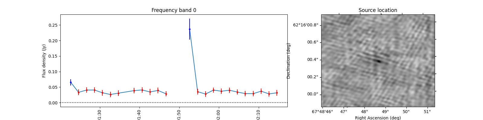
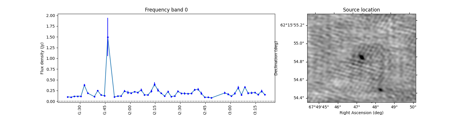
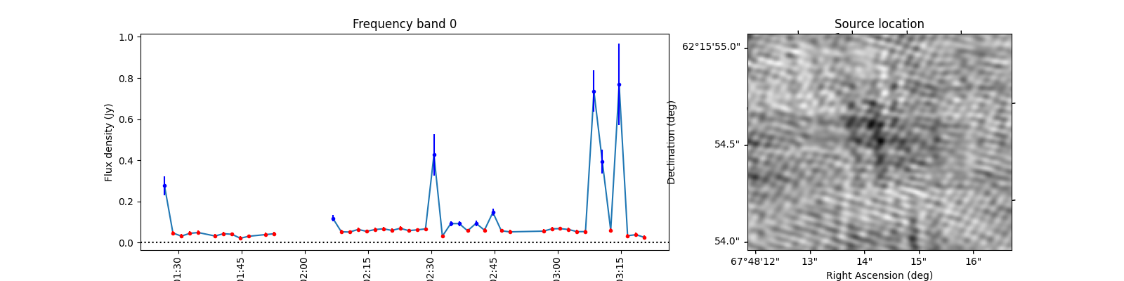
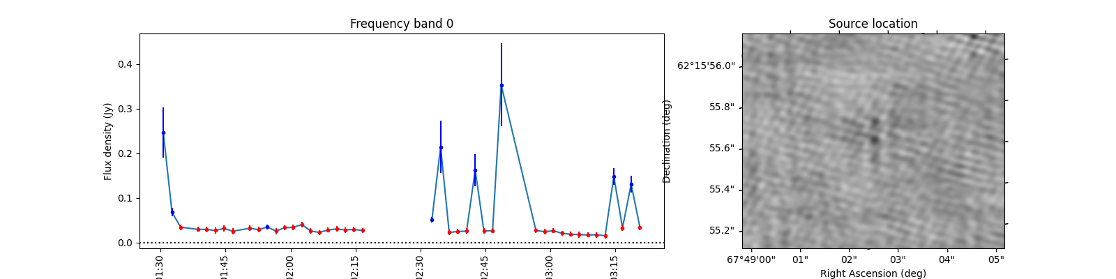
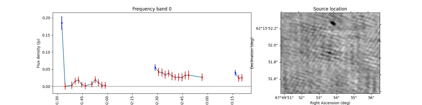
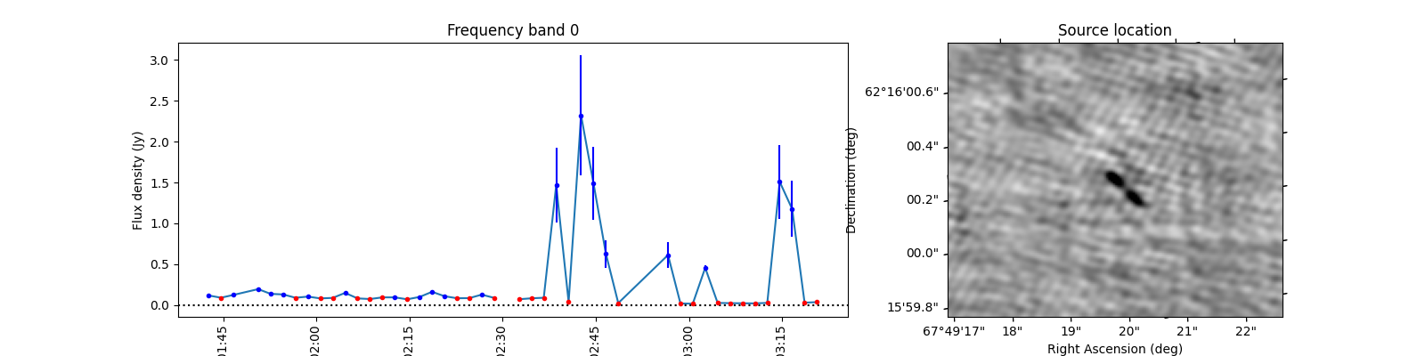
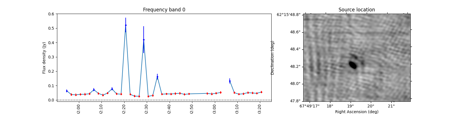
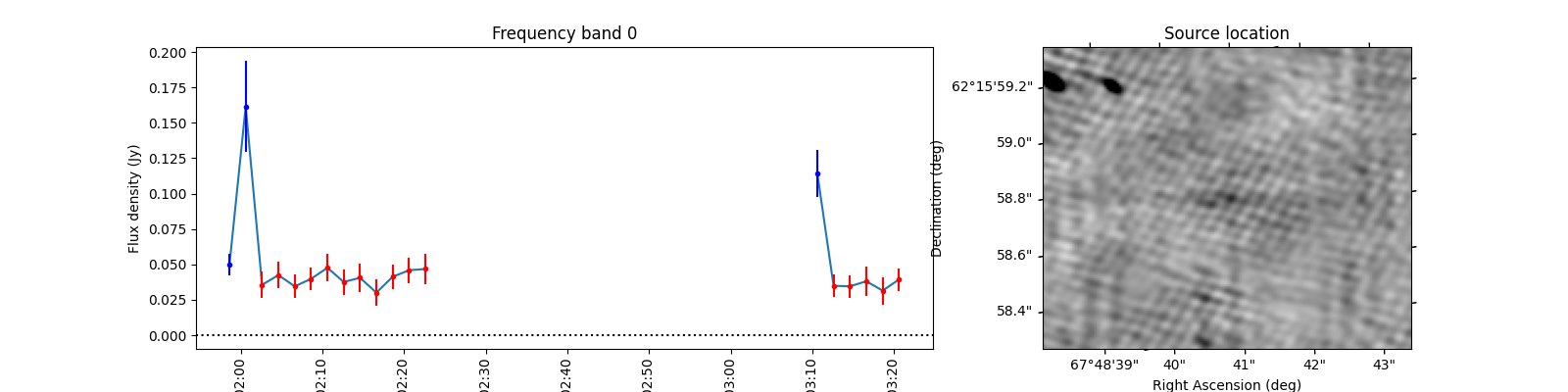
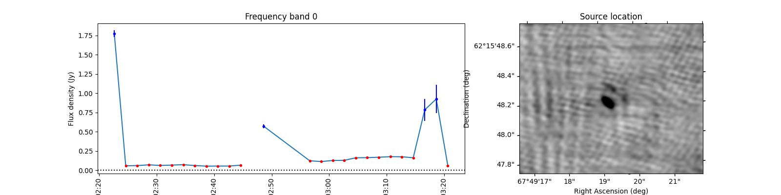
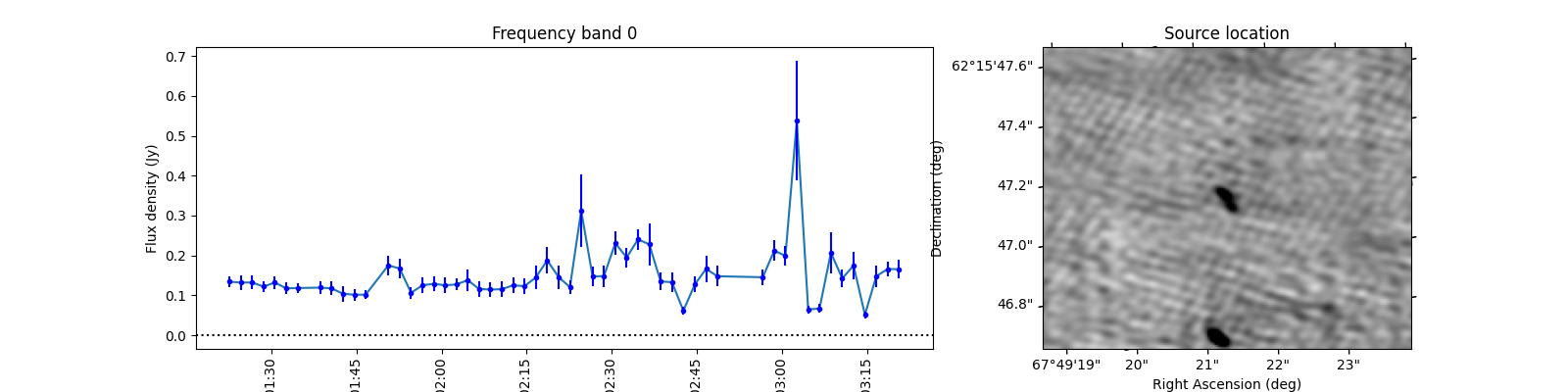
When observing these plots, several of them look like there is no source at the red markings. This is not a fluke. In these cases there was a source but since we just show the first image, the source was not present at that locaton in the first image. In most of these cases, the source moved (maybe satellite?) and can sometimes still be seen in the image but at a different location. This becomes more obvious when inspecting the zoomed in plot for multiple images, but we cannot show that in this example because we only have access to a few of the input images here to save space. I encourage you to run this example script on data you ran on your own machine and see if you can identify the image the source was brightest at (using the im_id) and plot that image instead of simply the first image in the batch like we do here.
Total running time of the script: (0 minutes 11.543 seconds)